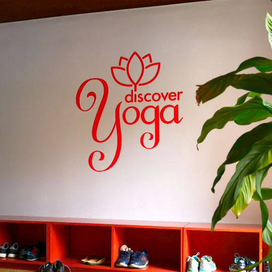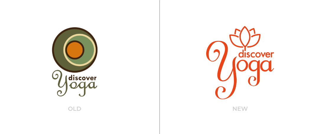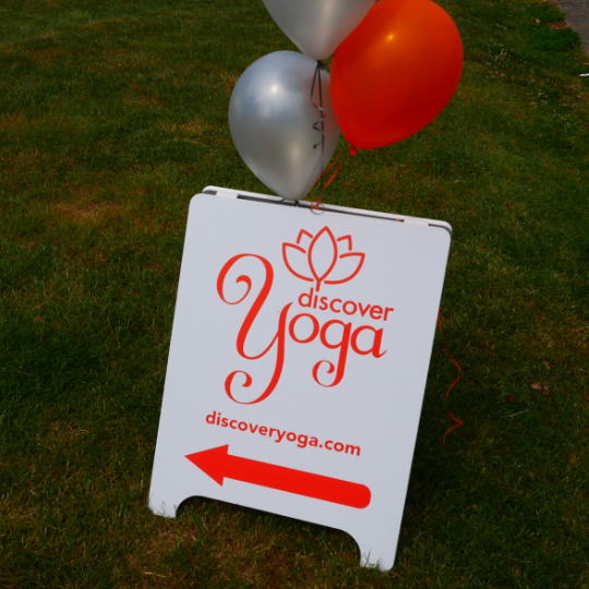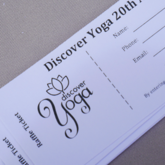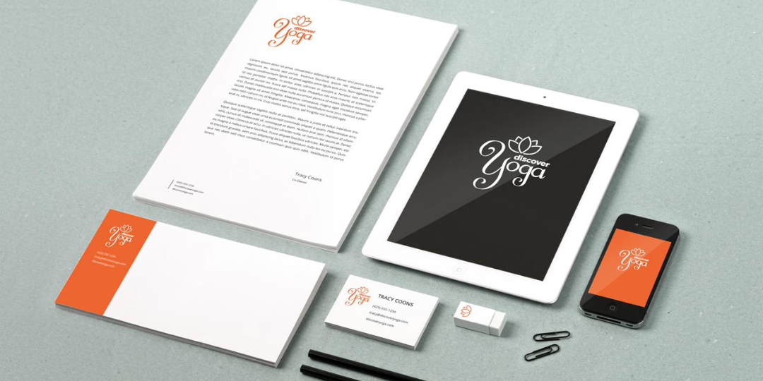
Discover Yoga is a local studio that wanted a brand
refresh for their 20th anniversary. We wanted to maintain brand recognition as they had essentially the same logo for 20 years.
refresh for their 20th anniversary. We wanted to maintain brand recognition as they had essentially the same logo for 20 years.
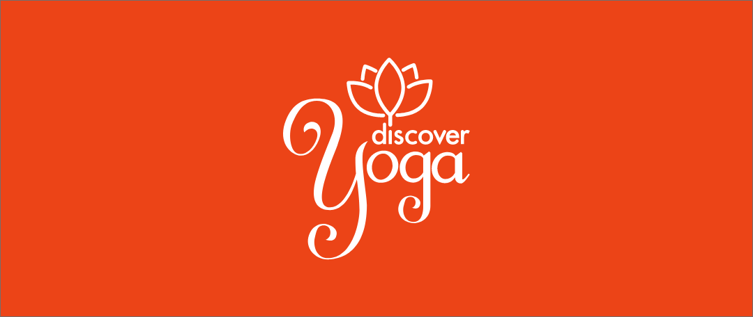
To achieve that I wanted to maintain the overall style and look of the wordmark while finding some consistency in letter forms and overall cleaned up script for better legibility.
We also wanted a more versatile overall shape to the logo, with a more recognizable icon. We dropped the concentric circles fondly known as 'the olive' and replaced with a classic lotus. I liked the idea of integrating the lotus into the logotype and having it sprout off of the dot of the 'i'.